‘Only connect.’
– E.M Forster
Reflections on
Message Delivered
Considering that from week 9 onwards I became incapacitated in my ability to produce to the level I normally would, the paradoxical idea of identifying an emotion that could be attached to the city or place where I am present wasn’t lost on me. As I move through the coursework I am repeatedly struck by the parallels between design and psychology and the interplay of the emotional need and output required to successfully navigate both disciplines. Of course, this shouldn't be such a revelation if we adhere to the design principles that are established within ourselves at the start of our careers through our understanding and embracing of gestalt theory.
It was fascinating to hear Sam discuss the emotional gut and bring forth the idea of design as an emotional experience. and the that we should embrace the idea of touch, something I’ve looking to explore in my writings up to this point, and San’s point on getting away from the screen has a significant resonance as I realised my cognitive thinking to this moment in time was the ‘screen’,
So to the root of Susanne and Sam’s idea of how society's questions can be answered with design solutions. This raised a question, even though we design for an end-user, are we really designing for that user, or are we at a level designing for ourselves in a never-ending loop of form over function? And even if the ‘function is achieved, how do we ensure or measure that we have delivered a form that has been communicated through our emotional output and not our cognitive outputs. (this raises a bigger conversation of how we can time ourselves into recognising emotional decision making).
Of course, in one way we can help answer this through existing frameworks such as the idea of design thinking that help us design services that work and have helped shape a narrative and an understanding beyond the old base idealism of being led by the cognitive in creating a design (Ref: Edward Bernays, ‘Propaganda’). These frameworks which embody format and function help us understand and challenge the way we look at, think of and interact with the world.
Further Thought 1:
‘Not only do we live in on a material world but we are deeply embedded in it’ (Ref: Social Matter, Social Design, Jan Boelen, Michael Kaethler, 2020).
I thought of this sentence as I listened to Susanne talk and her ideas that we should embrace the unknown (taking from Kenya Hara) and embrace instinctive thought (rather than active perception). In a more nuanced and complex world, how do we still create time to allow exploration to exist considering that not only are we no longer at the mercy of commercial consideration, we are now entangled in the responsibility to produce a design that answers the bigger questions around the self, the planet, politics, and technology? And where does the idea of the emotional brain play into this? Is the mere idea of allowing ourselves time to explore and experiment actually impeding the idea of the emotional gut and its ability to deliver us clear answers unburdened by overthinking? Could design as an emotional service allow us to move beyond the romantic illusion of design solutions afforded to us by cognitive thinking and get to more clear and concise answers and solutions that answer some of the bigger questions we are been asked as a society?
Further Thought 2:
While looking at the idea of form and function coalescing to deliver the promise of the medium as a message I wanted to explore how cities have delivered messages through the medium in which it is implemented. Of course, when we think of cities we think of concrete and more in our part of the world, brick, as this is one of the primary visual identifiers of buildings. Interestingly, enough, bricks, in general, relate back to the size of the human hand to allow an optimum compromise between the efficacy of form and the economy of time ( bricklayer must lay “x’ amount of bricks per shift, etc).
In general, the size of the brick has remained static over time, but in 1784 a tax was imposed by the British Government on buildings per brick. This created a response whereby manufacturers increased the size of the brick (form) to ensure that buildings could still be built at a cost (function). It also served as a message o the British Government who on observing the response repealed the tax in 1850 and which eventually created a standardisation of brick size that is maintained to this day. (Ref: http://britishbricksoc.co.uk/wp-content/uploads/2013/07/BBS_67_1996_March.pdf)

Research
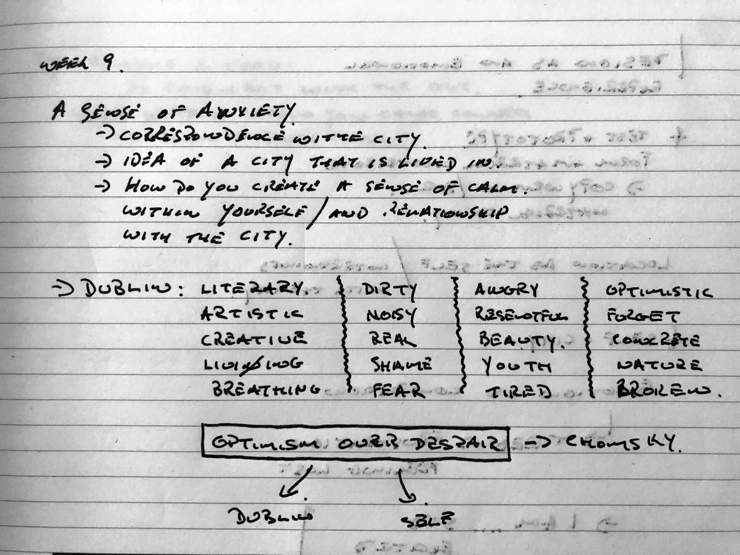
The question raised when looking at Dublin as a city was the identification that the sensory cues you take from the city tend to overburden the senses. This got me thinking of how an approach to reducing noise and decluttering the visual landscape in the public sphere would impart a viewer with a moment to breathe.
Recently I have been thinking about my uncomfortable relationship with the city and the creative disorder I display when working within the confines of Irish design and wanted to formulate wording that represents my feelings and my viewpoints and use them to create a pathway to a figurative solution when approaching my response to an emotional connection.
Literary/ Artistic/ Poetic/ Creative / Breathing / Living/ Dirty/ Noisy/ Real/ Shameful/ Fearful/ Angry/ Resentful/ Beautiful/ Youtful/ Tired/ Broken/ Optimistic/ Forgotten/ Concrete/ Natural/ Anxious/ Miserable/ Anxious/ Tipsy
Simple enough words, but it allowed me to answer a question. What happens when we willfully submit to the beat of a city and forgot our place within it? And how can you create that moment, to literally stop, take a breath and observe the meaning of what the city means?
Breath became the word that resonated the most, partly due to the fact that I didn’t want to associate any negativity with my approach to identifying and primarily due to the fact that the idea of emotional breathing can tackle one of the emotions that we can all relate to in a city, Anxiety.
What I was interested in was how design could facilitate a breathing response to emotional states within the city landscape. Emotional states by their nature change the pattern, rate and depth of breathing. Could a simple piece of social design create that moment to breathe?
Further Thought 1:
Breathing can change in response to changes in emotions as emotions have a physiological effect on the entire body with studies showing a higher arousal state involving rapid breathing when this change is enacted. While our understanding of the complexities of this relationship is incomplete, effective strategies have been established that can help manage emotional regulation through deep breathing exercises helping to reduce stress and anxiety in a socially appropriate way.
Breathing changes in response to emotional states, such as sadness, happiness, anxiety or fear. On the other hand, emotional states change the pattern, rate and depth of breathing. Complex coordination, not yet fully understood, involving widely dispersed brain centres in the cerebral cortex, limbic system, medullary and pontine areas, together control the correlation between breathing and emotion. This intricate correlation between breathing and emotion is essential to synchronize metabolism, energy and other physiological parameters of homeostasis with changes in the environment. Adept correlation of breathing with emotional states not only maintains homeostasis but is also essential for survival.
(Ref: https://medcraveonline.com/MOJAP/MOJAP-03-00108.pdf)
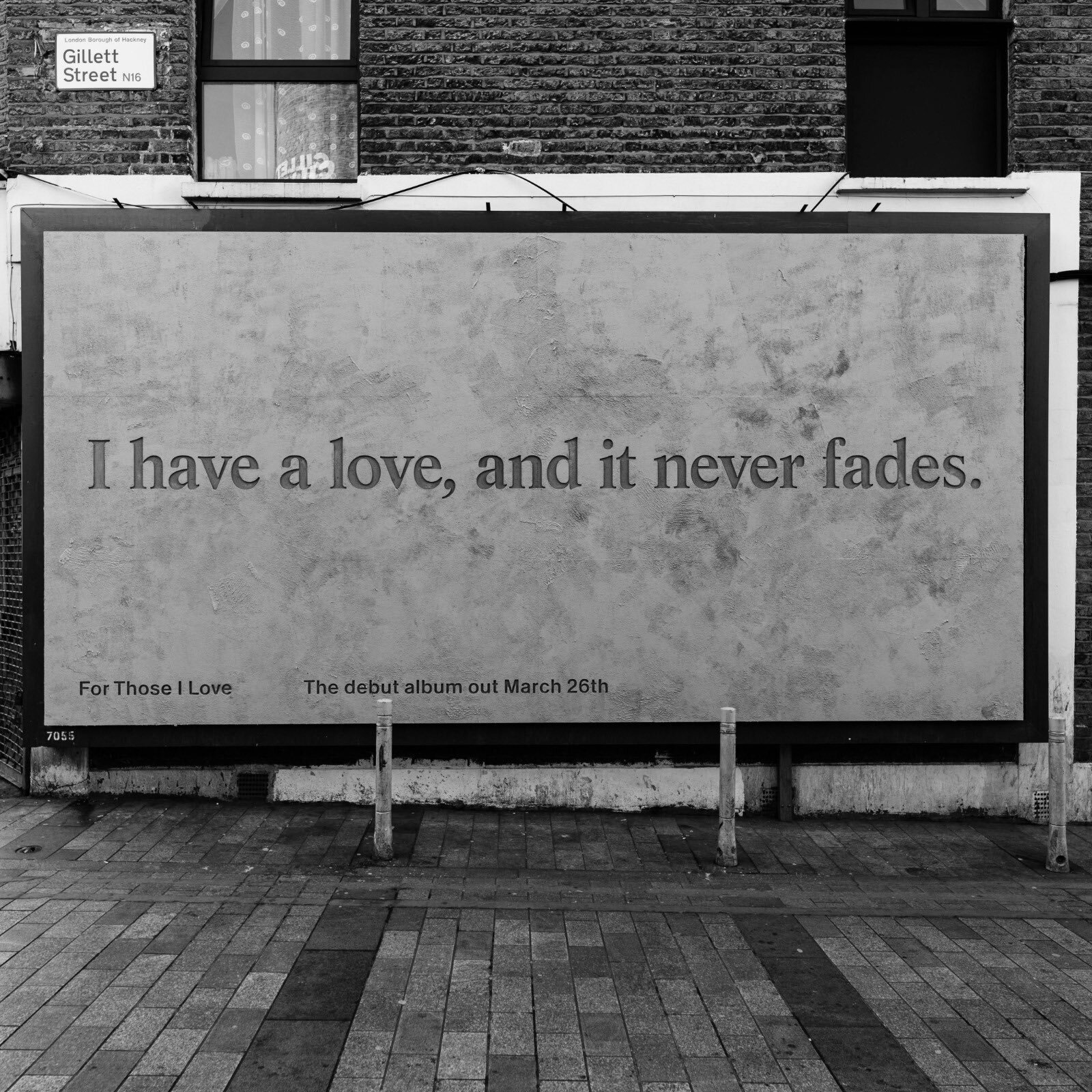
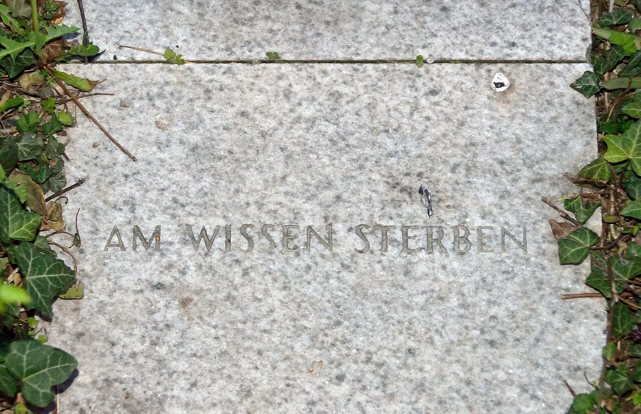
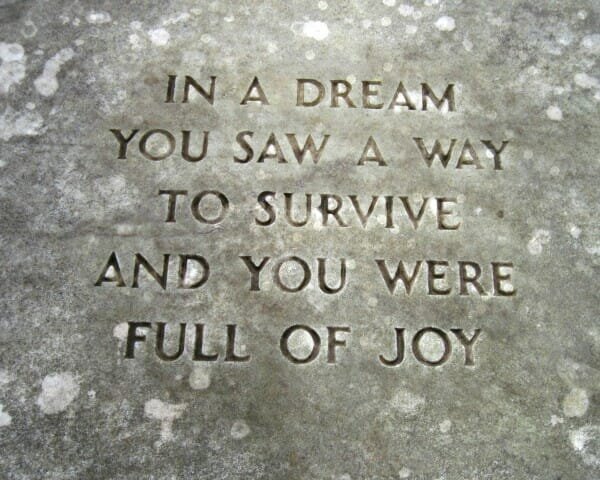
While researching a route to take I had Chomsky’s phrase ‘Optimism over Despair’ in the back of my mind. I also explored a musical artist, David Balfe, who had just release an album called “For Those I Love’. At its core, the album pays tribute to Dave's best friend and former bandmate, Paul Curran though it was more the approach to how he communicated a line from the album that resonated. The use of simple, clear copy married against material surfaces of the city sparked an investigation into how the same materiality when paired with a succinct copy could provide that ‘breathing’ moment I wished to achieve. The question then would be, what is the copy and how could that copy relate back to the city of Dublin. This brought me back to one of the keywords I wrote down, Literary. With no shortage of literary greats in the city could phrases or paraphrases be utilised to stop, connect and create a respite through a moment of thinking and breathing for a viewer on their daily travels through the landscape of Dublin?
As I am. As I am. All or not at all – James Joyce
The sun shone, having no alternative, on the nothing new. – Samuel Beckett
Life isn't about finding yourself. Life is about creating yourself. – Geroge Bernard Shaw
Additionally, taking a reductionist approach to the work, I wanted to explore a simple typographic style that would cut through the noise of an overcrowded landscape and draws the viewer in to explore the space created by a single typographic sentence on a white background.


Final Outcome
Throughout the process of research, it rained constantly on the city, creating an even more disparate nature to the sheen of the city. Previously I’d captured this rain as it hit the city streets a film price for the ‘Noticing the ignored’ module and I wanted to explore whether a simple video piece could be created to reference the mood of the city married to the literary quotes I had pulled.
While I was happy with the visual output of the film piece, I felt I hadn’t answered my original thought of how to create a moment of respite, to alleviate the anxiety of the city and let the viewer breathe. This brought me back to a simple typographic poster or imprint that could be hung in the city creating a sense of white space and decluttering of the visual and audible noise we’re bombarded with daily. For this reason, paste-ups we’re utilised as these generally appear quickly in high-footfall areas creating the maximum opportunity to engage with the viewer.
Typographically, looking through my research and the Georgian landscape of Dublin, a serif felt more appropriate for the typesetting of the quotes. Times Now Semi-light and Italic Semi-light was selected and intentionally set at a smaller pt size to draw the viewer in and create a meditative state as they focus on the meaning of the words.
No grids were harmed in the making of these layouts!


Reflection
I felt that while my time is limited due to ongoing problems, the approach and research remain in line with my previous submissions in continuing to formulate a design approach to my understanding of emotion and its direct impact on creative output.
I was also happier with the outcome of the piece as it shifted my thinking away from the commercial sphere I had occupied the previous weeks and allowed me to move back into a more experimental space where I could play with simple letterforms, film and words.
While I continue to struggle elsewhere, I note that my ability to deliver simple solutions to bigger questions hopefully remains intact.
References:
(Ref: Edward Bernays, ‘Propaganda’)
(Ref: Social Matter, Social Design, Jan Boelen, Michael Kaethler, 2020)
(Ref: http://britishbricksoc.co.uk/wp-content/uploads/2013/07/BBS_67_1996_March.pdf)
(Ref: https://medcraveonline.com/MOJAP/MOJAP-03-00108.pdf)