‘Language is a body, a living creature… and this creature’s home
is the inarticulate as well as the articulate.’
– John Berger


Research ‘History Revealed’.
I started to explore the relationship between the traditional divide of North/ South Dublin and track a path from the Old Georgian Quarter to the newer parts of the city to try and understand how a cities signage cannot only be read as a marker of social change and gentrification/ rejuvenation but also as a signpost to a historical past that unless documented will be left to disintegrate along with the buildings that house these important letterforms.
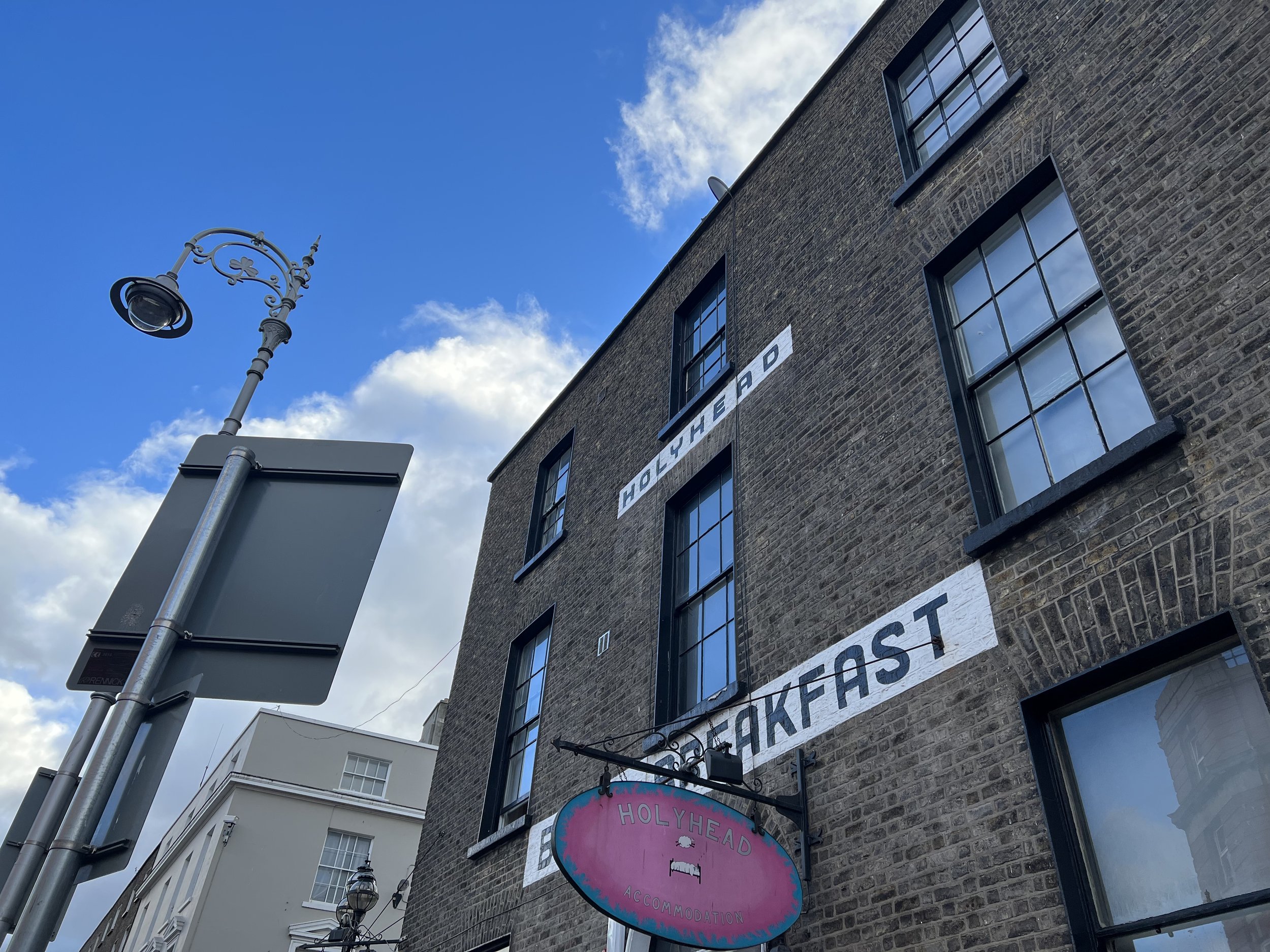
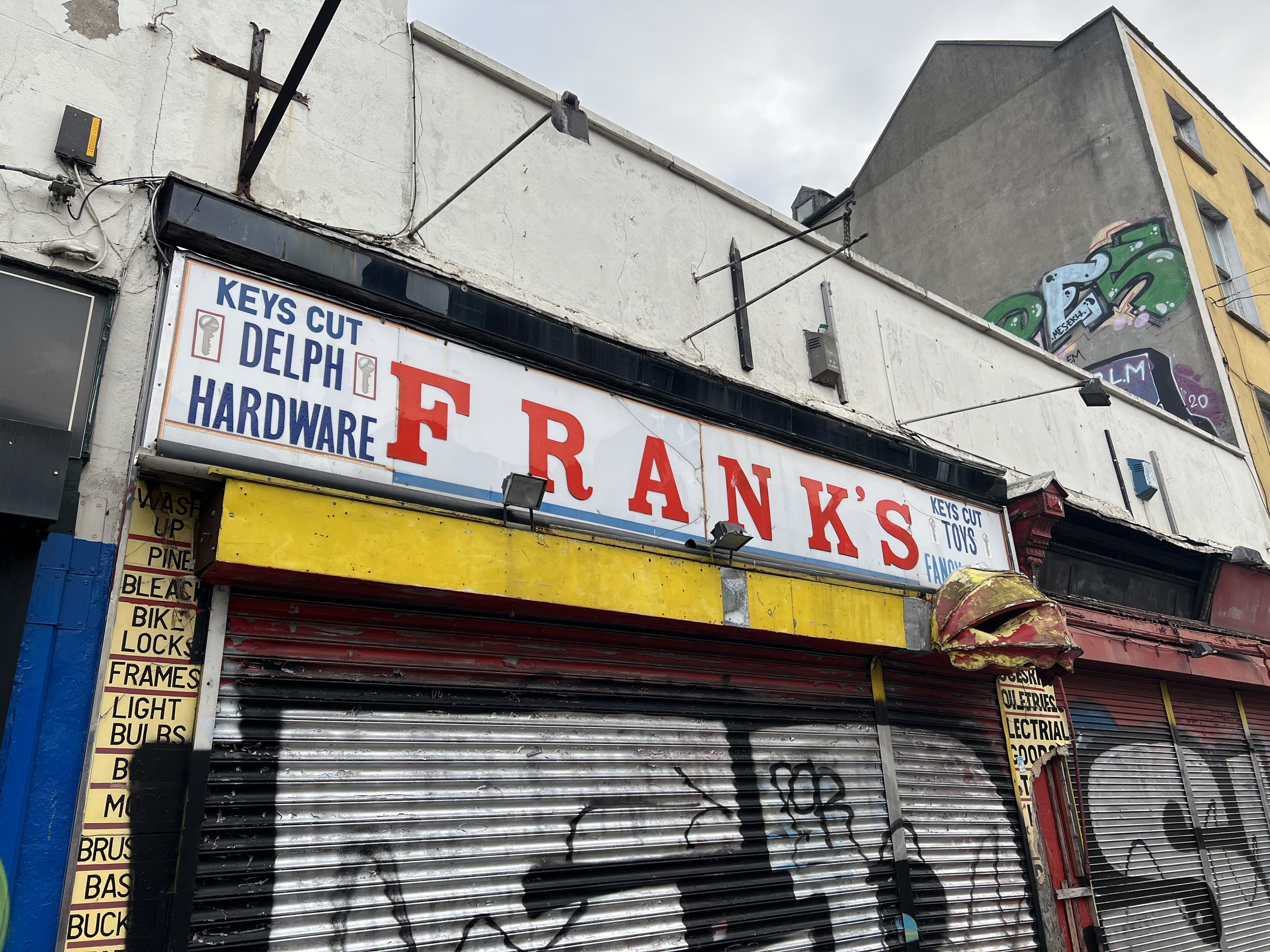
What transpired was exposure to hidden parts of the city that are in plain sight, yet point to the past and the slow decay of typographic style and signage that no longer convey their original messaging. While crisscrossing a city with Dublin’s historical architectural past you have to remind yourself that most of the city is of old foundation and that its fabric will show evidence of these differing periods (The Concise Townscape, Gordon Cullen). This evidence revealed itself in numerous ways signposted on their original nameplates to faded store signs baked into the crumbling facade of the buildings it once proudly advertised. Like most ancient cities that have grown economically and socially, Dublin maintains a non-conformity to type design displayed in its environment and with this non-conformity, one has to ask do we lose the meaning of the message? Does toponomic typography no longer hold a connection to the buildings that it once did, and does the unloved lettering on certain buildings point to the demise of both buildings and areas or point to coming gentrification as buildings are allowed to fade in the socio-economic belief that the land they occupy becomes available for more modern builds. This thought builds on the idea of Molly Woodward’s work where she believed that vernacular typography was a vanishing art under the assault of global retail and reframes it in a modern context where global retail is no longer the threat but global property development.
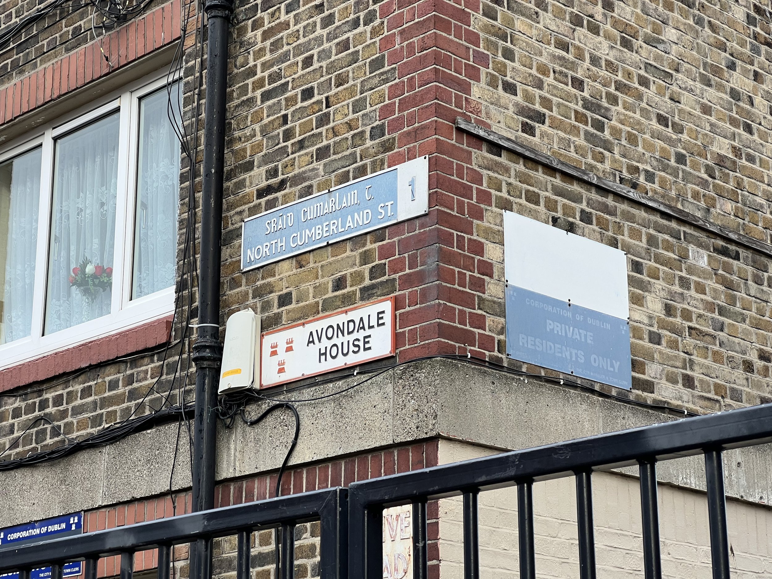
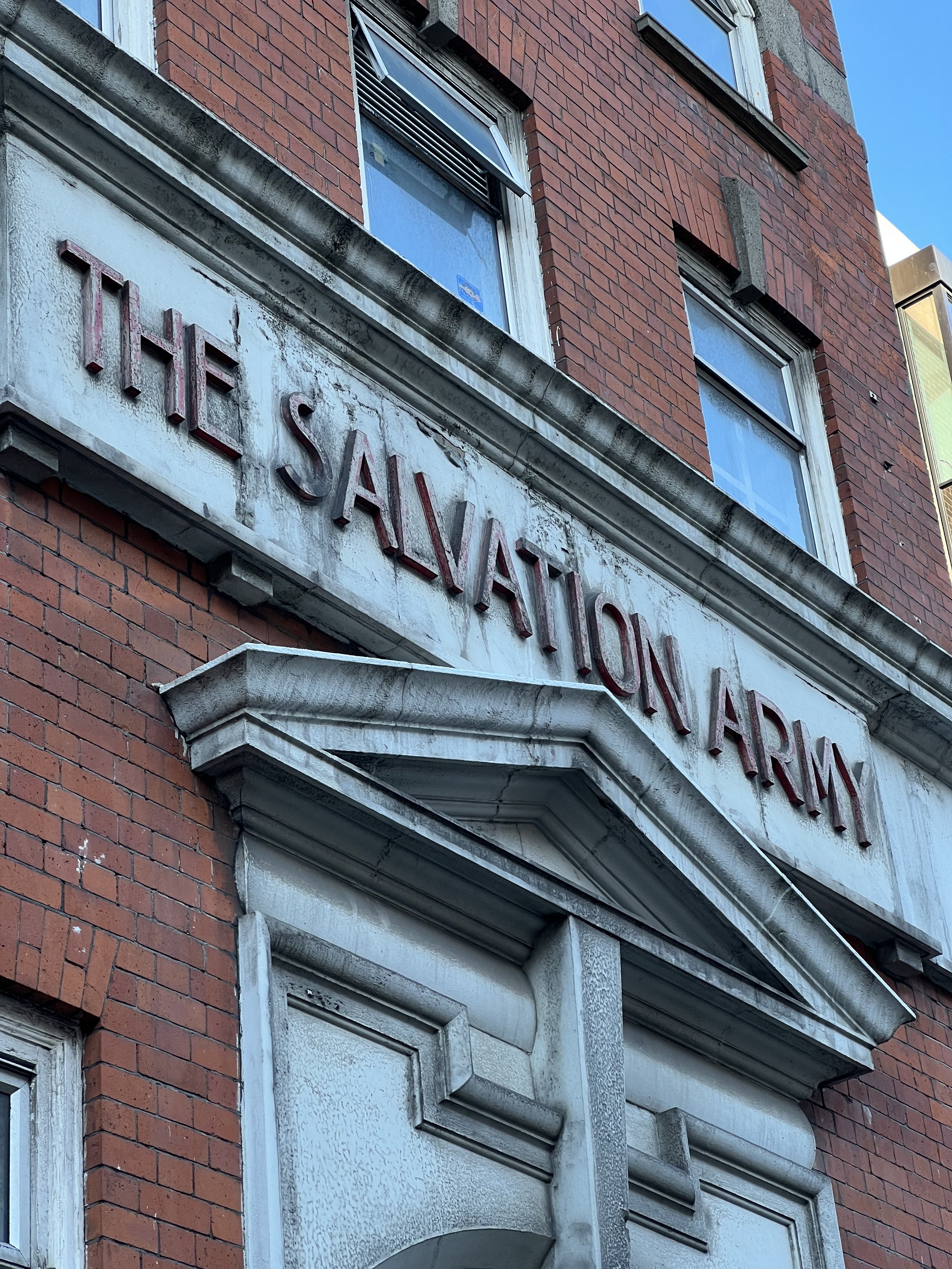
A second question arose when exploring, how is that Dublin, after having been part of British Empirical rule didn’t establish a typeface that would act as a blueprint for the cities identity similar to the introduction of Johnston Sans for the London Underground. As Stuart in the lecture reflects, “most successful typographic street signage and transportation way-finding systems are omnipresent but go unnoticed”. (Tolley, 2022). To understand the reasoning for this apparent lack of uniformity, it is critical to understand the place Irish typography has had within the national identity and how this national identity had to both embrace the ‘colonial ruler’ and accommodated its’s own language, no more evident than in the placement of both English and Irish in our street nameplates. This route was reinforced by Irish nationalists who utilised the Gaelic language and by extensions its letterforms in justifying the promotion of Irish independence and evidenced the Petrie typeface (Annals of the Four Masters, 1851) developed as part Of an ordnance Survey of Ireland commission and the Newman typeface, an improvement on Petrie.
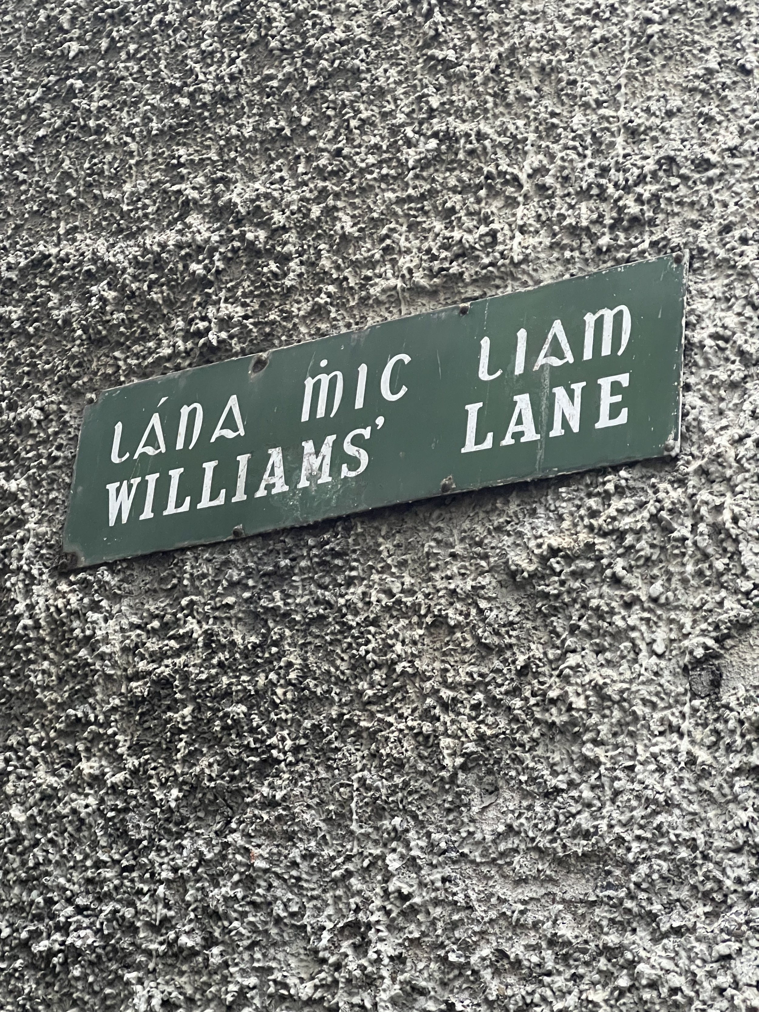
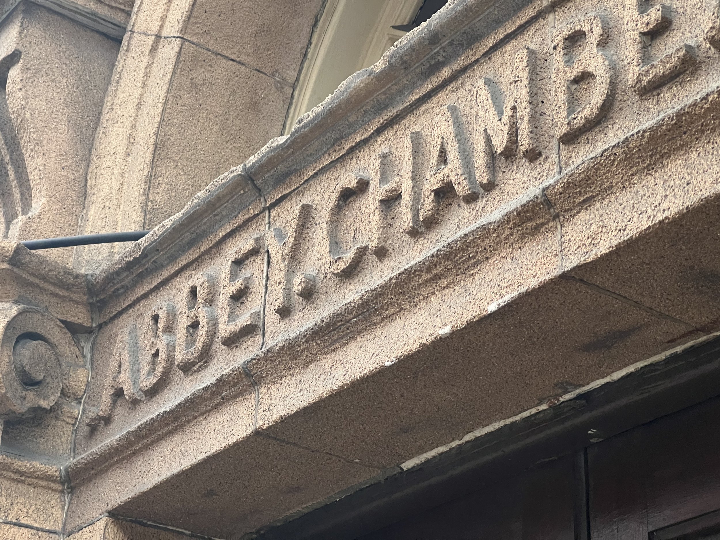
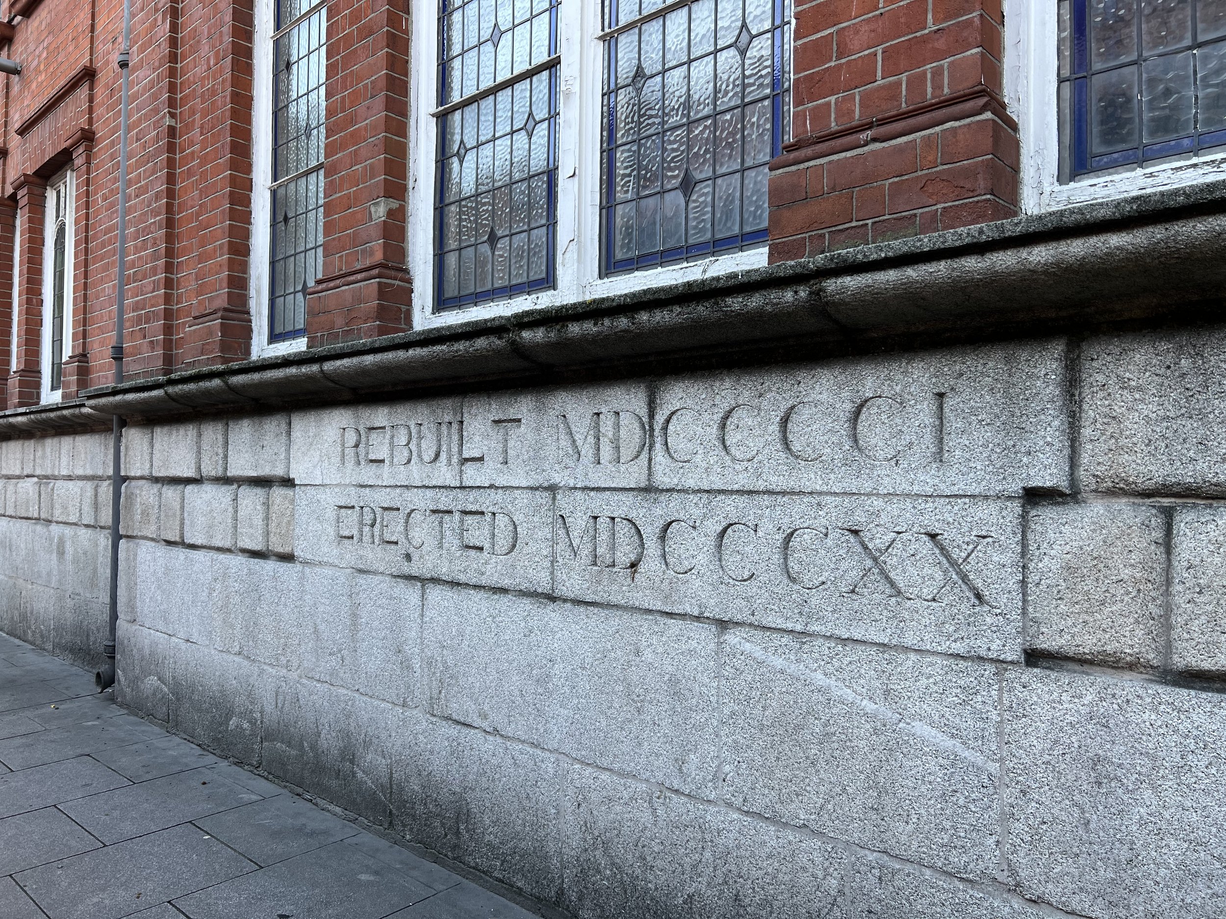
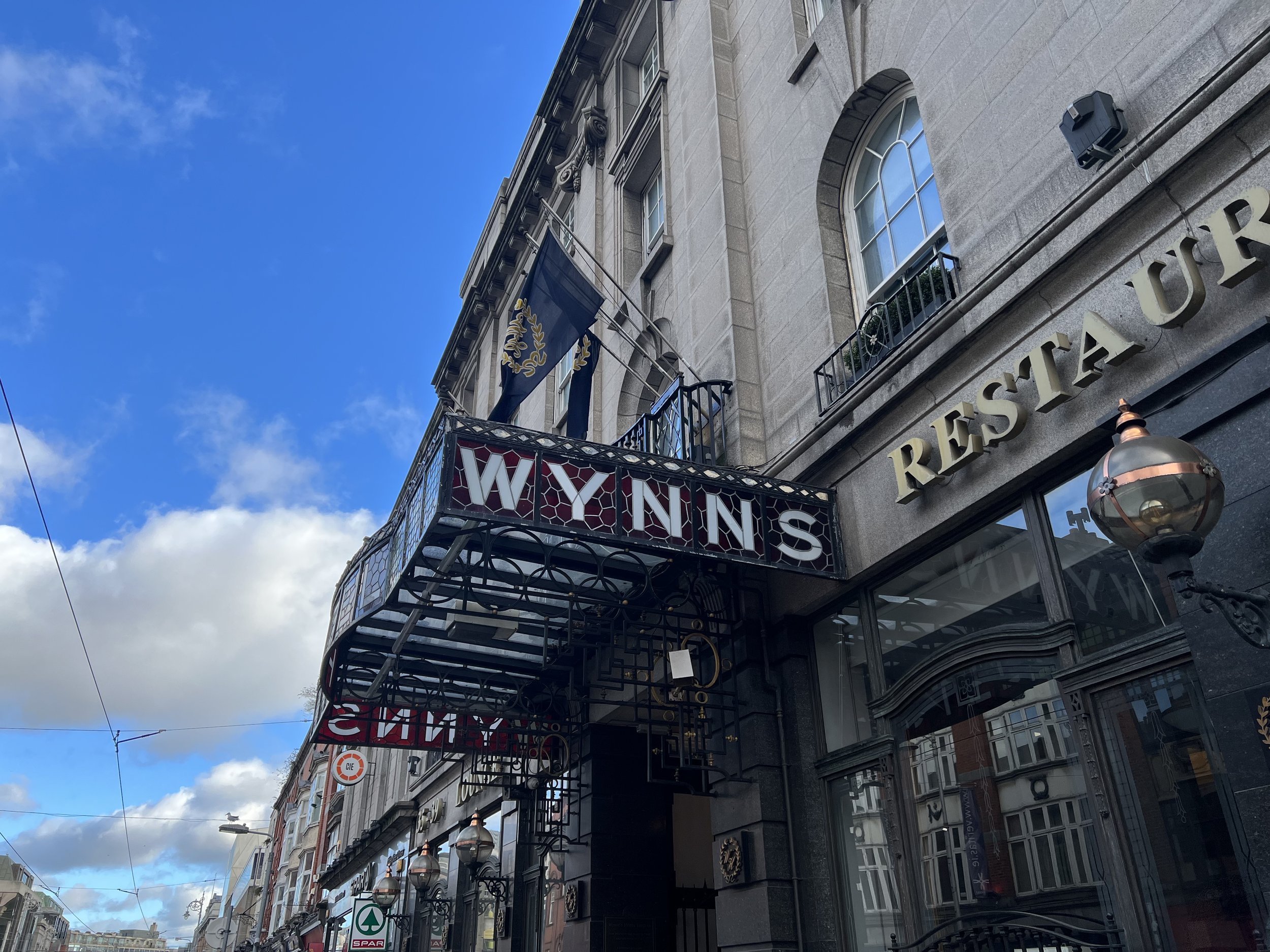
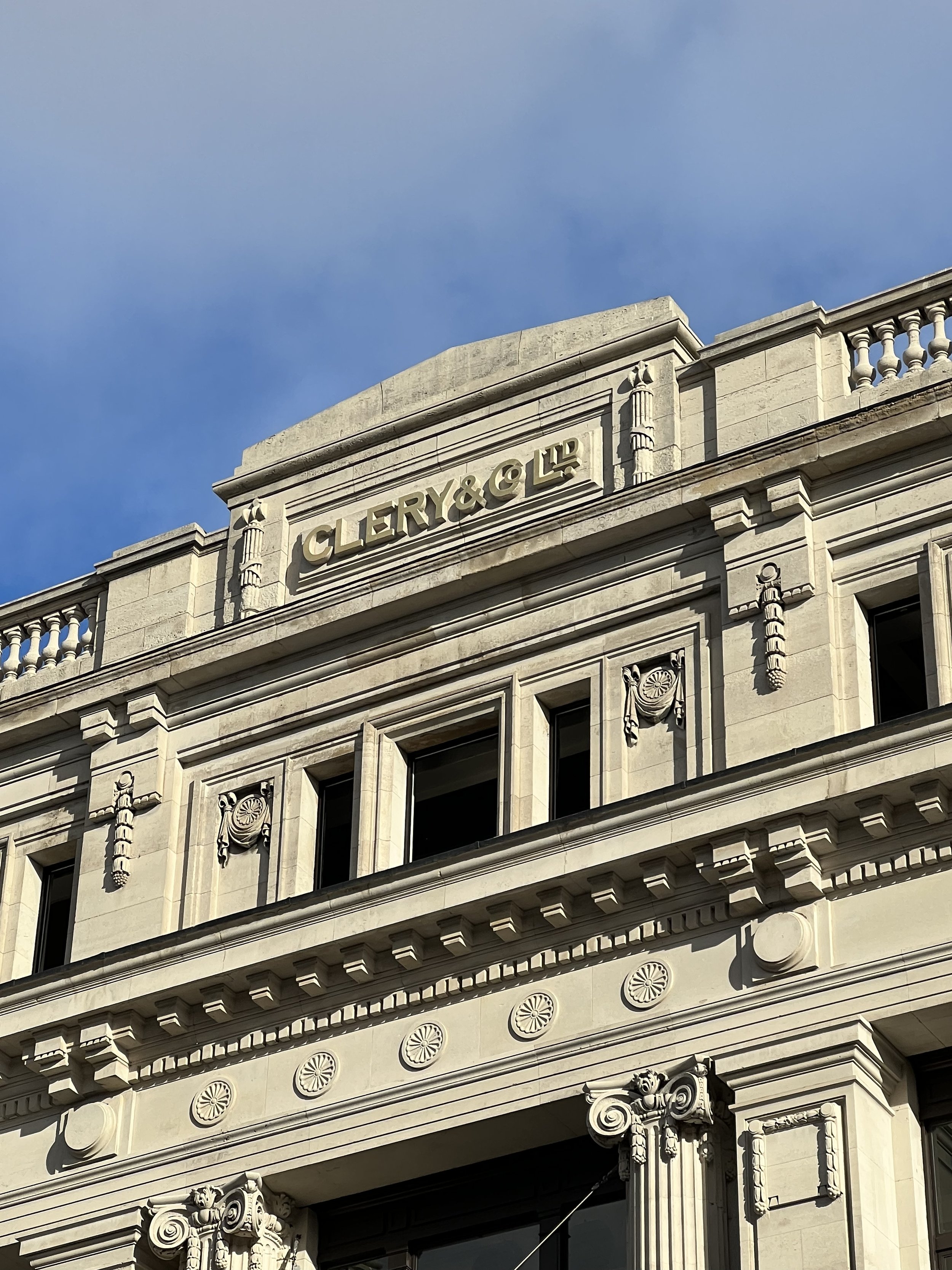
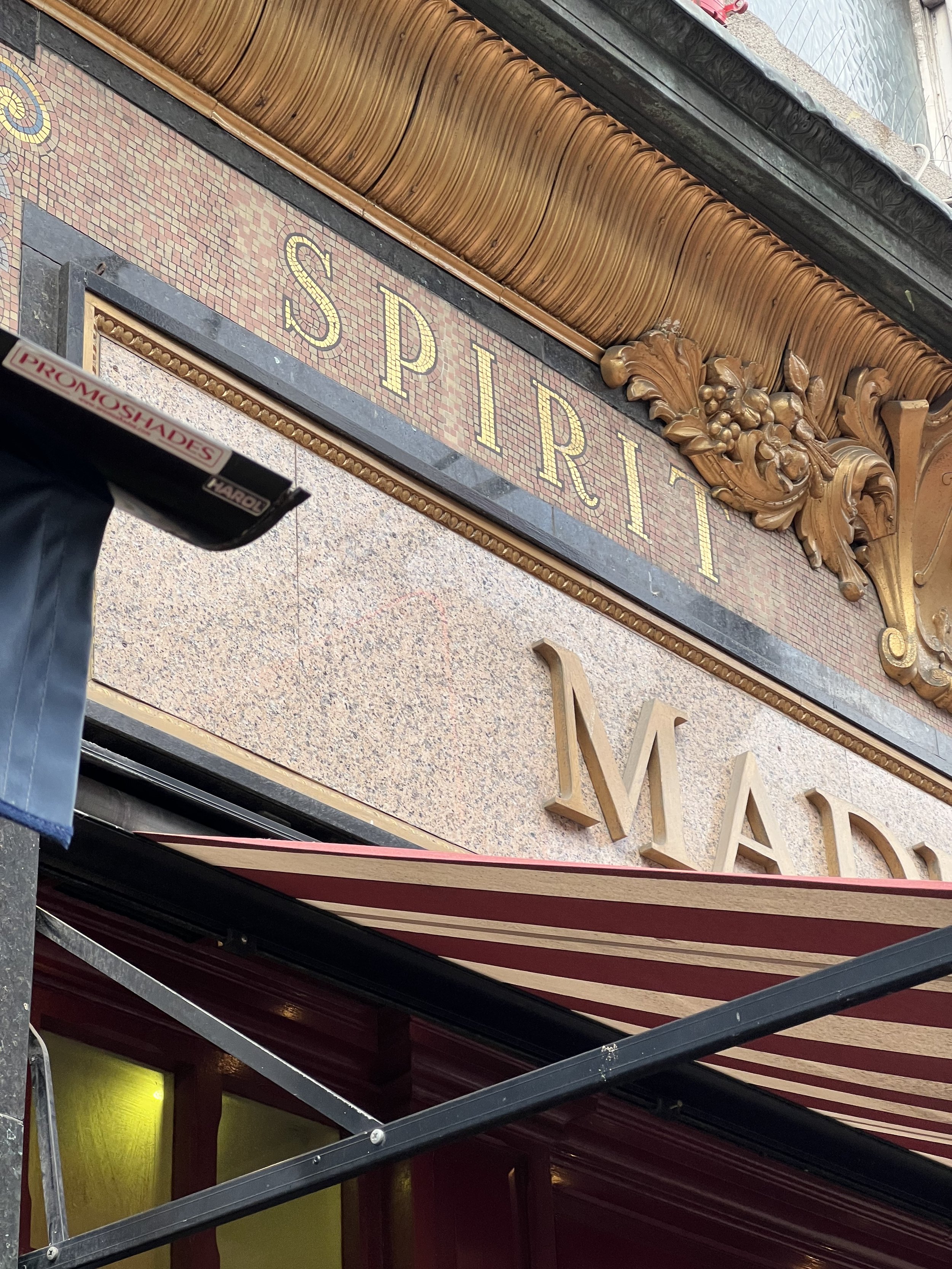
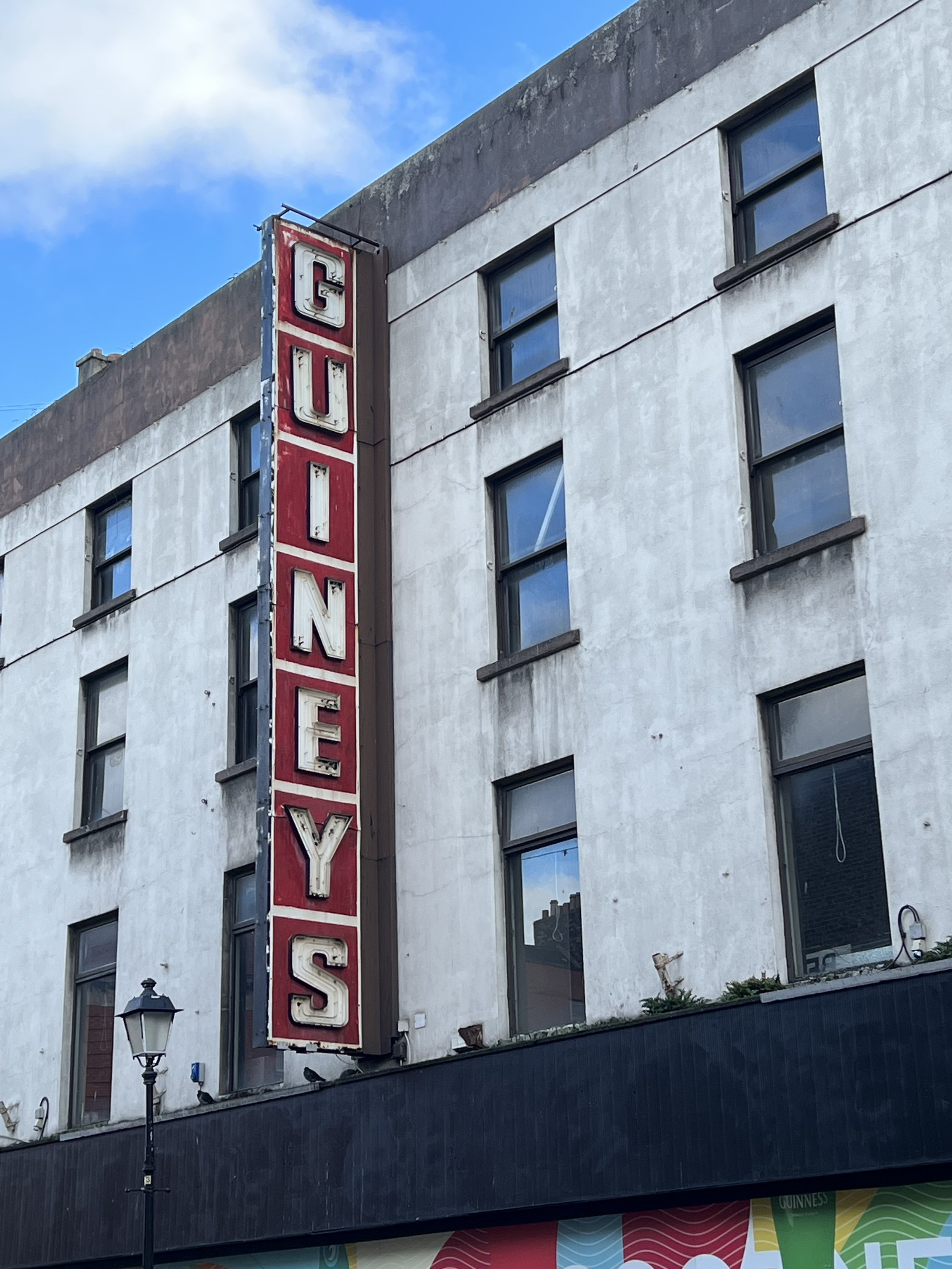
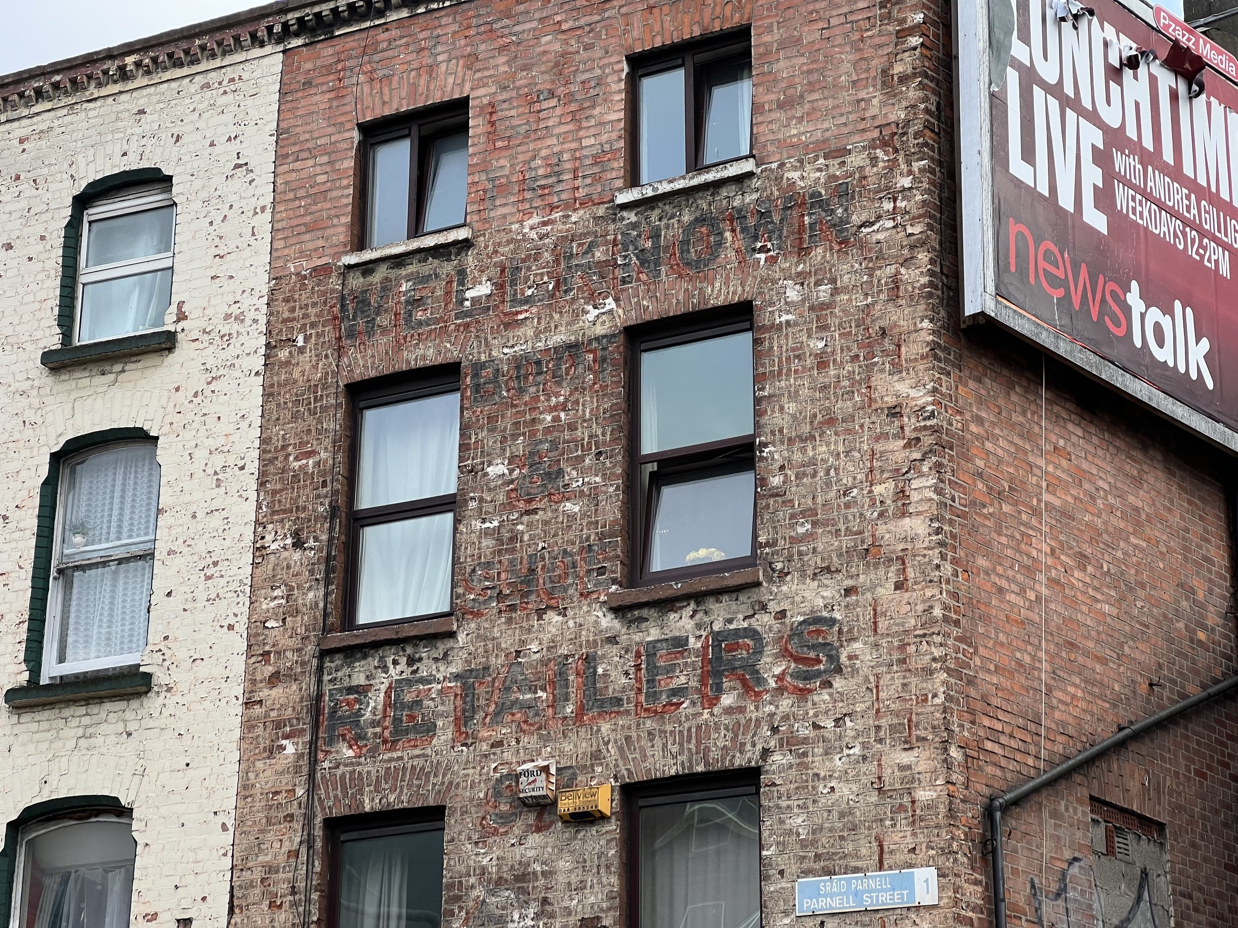
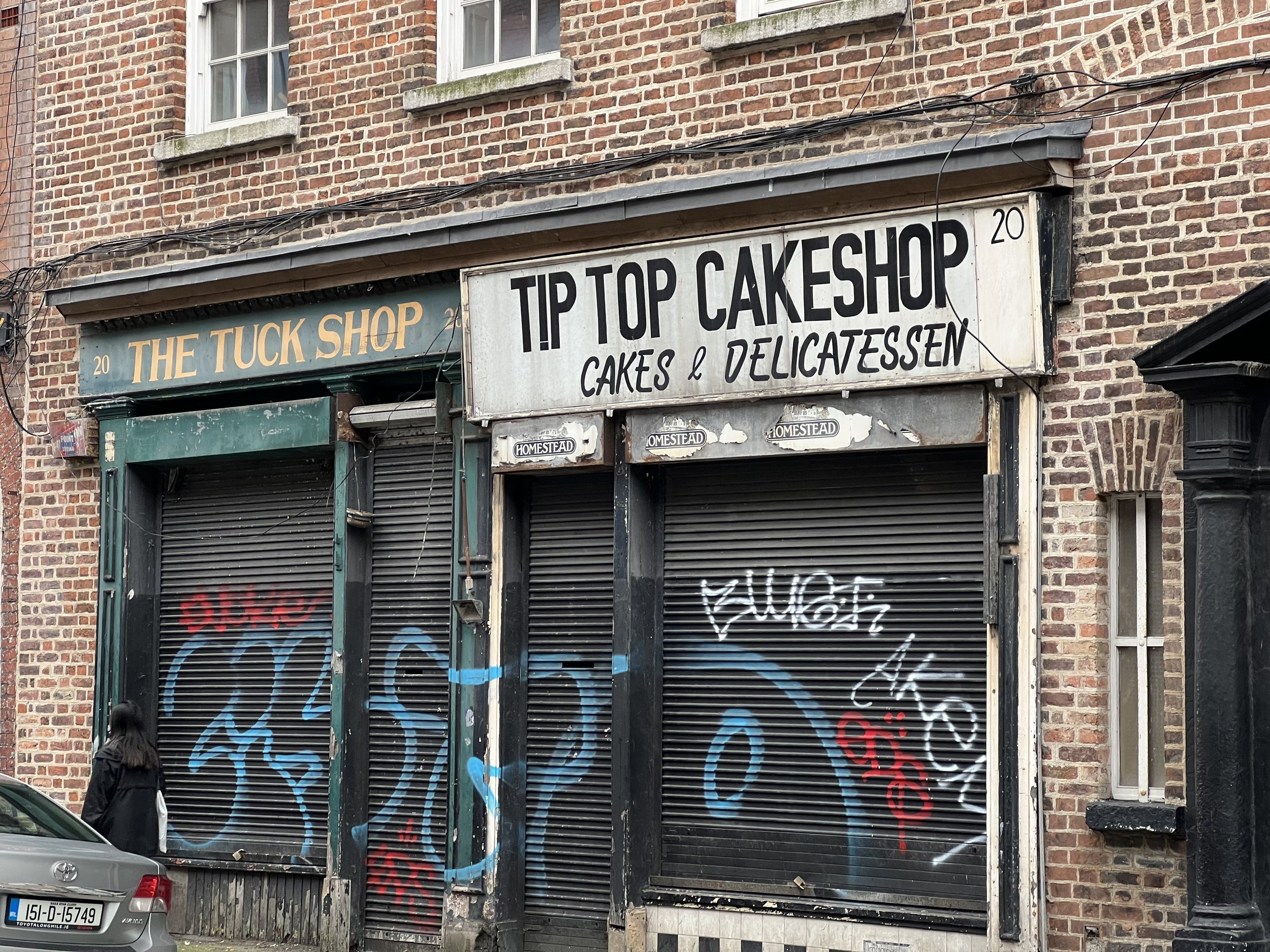
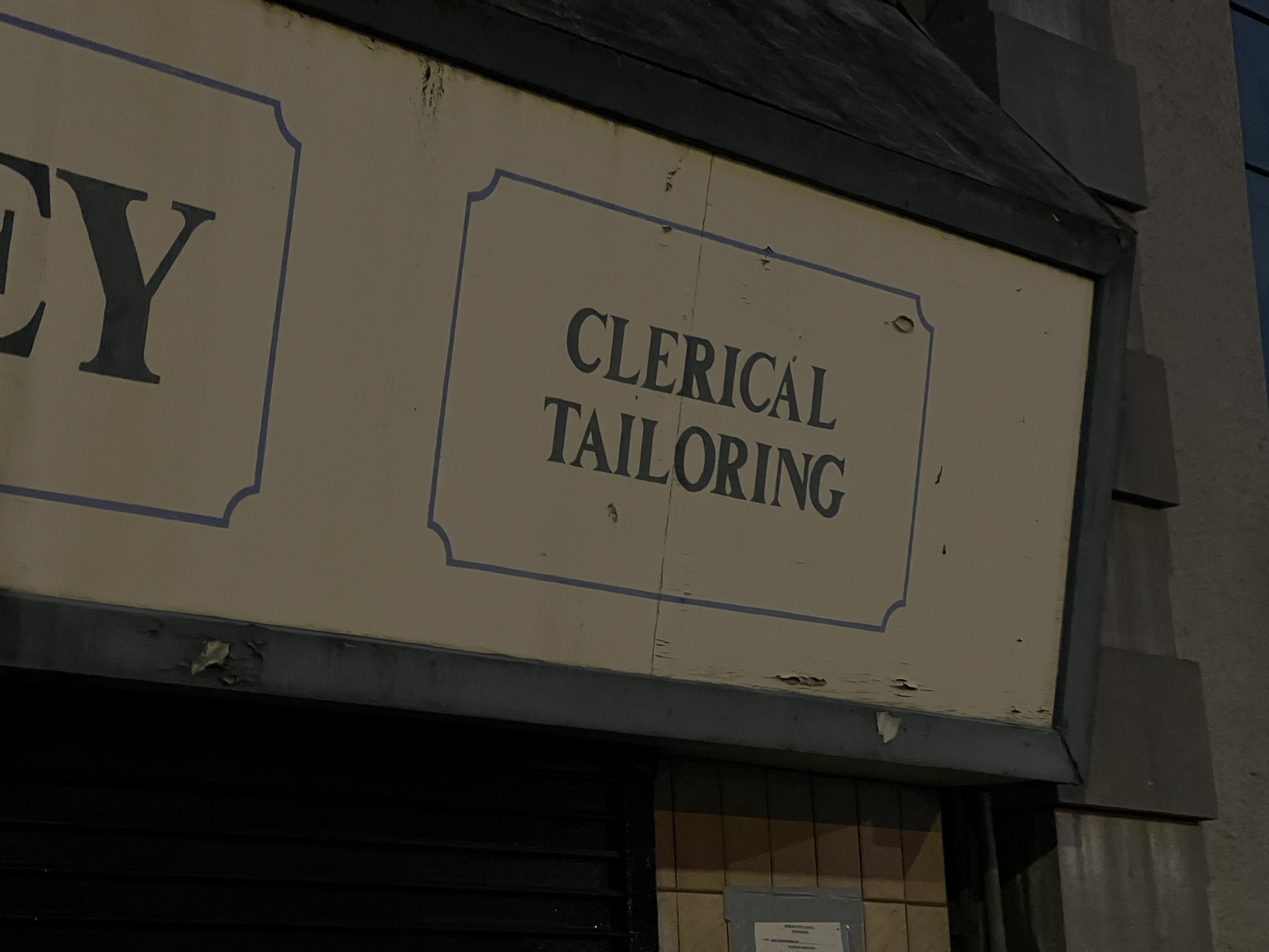
So, what ultimately do we observe when we survey the land space of Irish Typographic design and its relationship with the environment? We identify a lack of uniformity in official place-names pre 1960’s which can still be evidenced today. Certain nameplates predate the addition of the Dual language approach as noted on the Black nameplate of Gardiner Street Lower. Particular signage relating to church and state has a more formal lettering approach that relies on that continues to relate back to the era of Petrie letterforms. Evidence of Pre-independence typographic lettering can be seen in images such as the Williams and Woods, a former chocolate factory. Beyond, the erratic typographic signage still evident in the areas of Dublin not gentrifies point to similar communication tools that could be evidenced in most towns in the British Isles. Moving beyond, as the country has grown socially and economically, so too has its’ relationship with environmental signage and advertising with a preference displayed for for referencing European design and a reductionist approach to typography eschewing flair except in certain cases where it part of the DNA of the building/ organisation it is representing.
Further Thought 1:
One allowance to the uniformity approach to street signage is the bland use in Irish place-name signs as evidenced in the image below which uses, Transport Medium, a font designed for the British motorway network in the 1960s and screams third motorway exit after Birmingham rather than Dublin City.
There have been calls to revisit these signs With Dublin City Council's Transportation Strategic Policy Committee having previously expressed;
“That this committee notes the report on Street Nameplates and furthermore - recognises the attractiveness of the design of early twentieth century Street nameplates in Dublin City and suburbs;
- understands that the ‘Transport Medium’ typeface was developed in the UK for use on their motorway network rather than on city streets;
-commends the inherent beauty of both traditional and contemporary Irish typefaces;
-expresses concern at the use of bold lettering, and recommends that alternative typographical combinations be considered, such as a combination of upper case and lower case lettering; and requests that the manager seeks the advice of the Institute of Designers in Ireland on this and alternative approaches, and shall revert to this committee again within six months with a further report on the issue.”
(https://cuffestreet.blogspot.com/2017/07/signs-for-improvement.html)
Further Thought 2:
Given the space we occupy, we are less reliant on internalised knowledge and memory systems but instead on information design which supports us on our unknown journeys. Anthropologist Marc Augé reinforces this theme in his book Non-Places: Introduction to the Anthropology of Supermodernity. “The link,” Augé writes, “between individuals and their surroundings in the space of non-place is established through words or even texts.” In this scenario, the relationship between person and place becomes (in some instances)
(Ref: Marc Augé, Non-Places: An Introduction to the Anthropology of Supermodernity London: Verso)
(Ref: Dixon, B: Word and place in Irish typography. )
Design Development

Dublin is a city that relies on numerous visual cues to help navigate its ever expanding footprint. Unfortunately, these visual cues tend to focus less on word text and identifying signage to create a flow of movement. This then leads to the question of whether the signage of Dublin helps create an identity around the place or whether the typographic choices found merely act as pointers towards the past while the modern city struggles to create a modern identity encompassing a modern type approach.
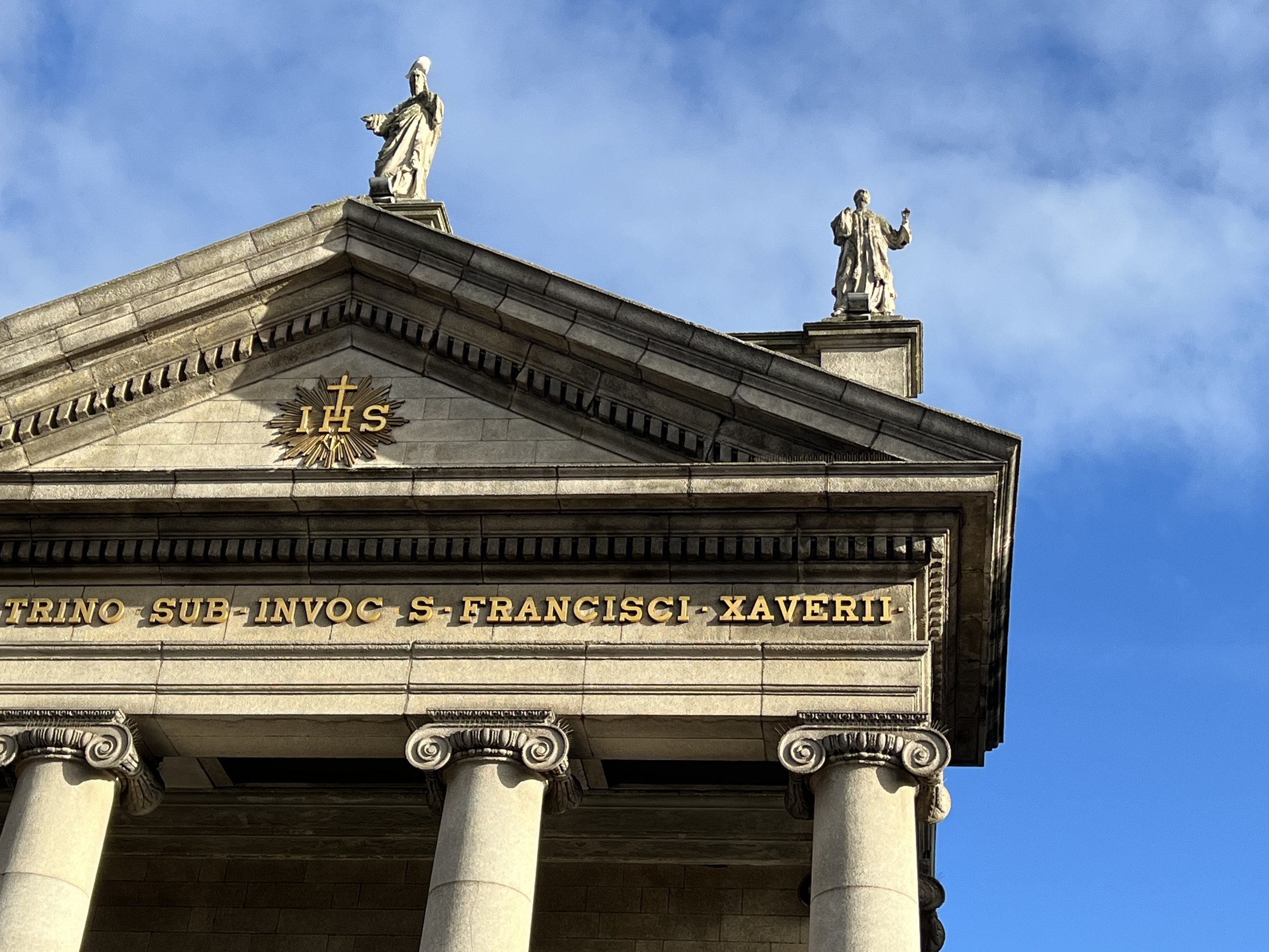
On further exploration of the signage of the city, especially the ghost signage which can still be found, one sees parallels with the established typographic systems that were present in the 18th and 19th centuries through England. Grotesque Sans-Serifs dominate the street furniture and signage. In contrast, unical and serif approaches are established both on state buildings and churches, indicating the struggles that existed in forging a national identity between Dublin and the UK. This national identity is further reinforced by the addition of what is ultimately a secondary language to the mix, in this case, Irish, only complements the process. It is inconsequential that the majority of users will ignore the text; its mere visual addition reinforces a sense of national unity regardless of its typographic approach.
In contrast, as one moves from the older parts of the city to the newer builds, we see less signage at play as modern companies and businesses eschew a need to overly promote themes-elves and instead rely on a more restrained typographic approach which speaks in visual cues to a more discerning and economically prosperous demographic. This could be read as soulless in its approach as it forgoes both the elegant, structured typography found on signage and the larger, brighter advertising signage that came to dominate the landscape post WW2. Interestingly, this renforces the idea that a typeface can reveal economical patterns as explored in the 2019 paper Typeface Reveals Spatial Economical Patterns where the argument is made that:
‘Understanding the socioeconomic and demographic characteristics of an urban region is vital for policy-making, urban management, and urban planning. Auditing socioeconomic and demographic patterns traditionally entails producing a large portion of data by human-participant surveys, which are usually costly and time consuming. Even with newly developed computational methods, amenity characteristics such as typeface, color, and graphic element choices are still missing at the city scale. However, they have a huge impact on personalized preferences. Currently, researchers tend to use large-scale street view imagery to uncover physical and socioeconomic patterns. In this research, we first propose a framework that uses deep convolutional neural network to recognize the typeface from street view imagery in London. Second, we analyze the relationship between 11 typefaces and the average household income in 77 wards of London. The result show that the typefaces used in the neighborhood are highly correlated with economic and demographic factors. Typeface could be an alternative metric to evaluate economic and demographic status in large-scale urban regions. More generally, typeface can also act as a key visual characteristic of a city.’
(Ref: https://www.nature.com/articles/s41598-019-52423-y)
Final outcome
On reflection, I choose 5 images that best represent the current tension that exists between old and new typographic examples found in the city and how observation, these 5 signs may act as a pointer to a future typographic system that could be embraced by the city as a means of providing cohesive wayfinding system for Dublin and it’s environs.
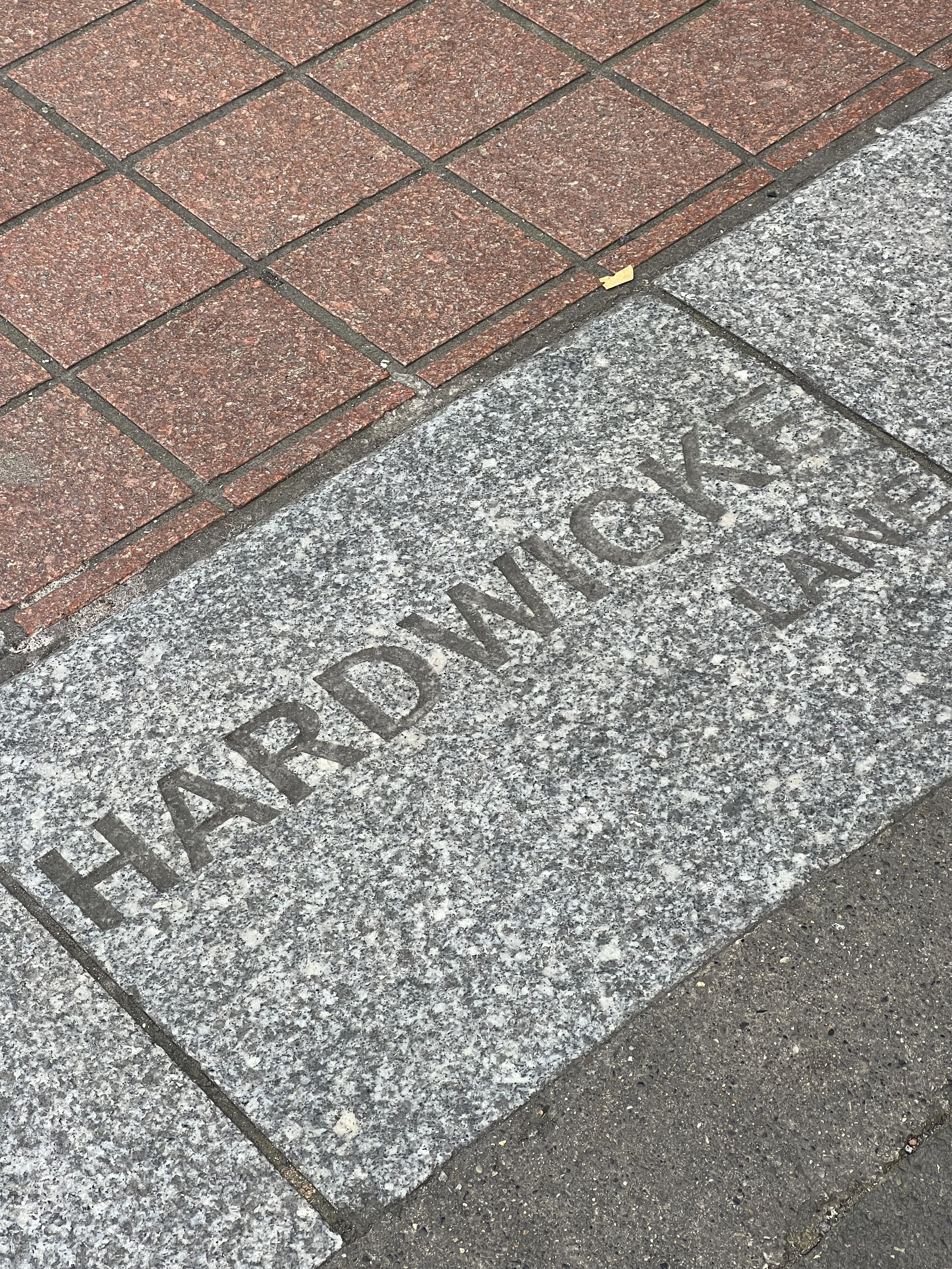
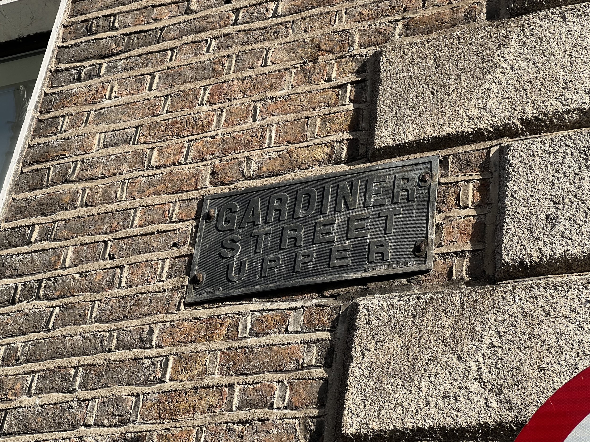
1. Gardiner Street Upper
An authentic nameplate found within the Old Georgian Qtr of Dublin1, these cart iron nameplates can still be found on the more well-preserved buildings and act as a pointer towards a Dublin that was still under British rule as these building would o been constructed between 1714 and 1830. On further observation, the manufactured of the plates can be observed, G, Grant Dublin and an indicator that this type of nameplate was under patent. The use of a sans-serif grotesque typeface suggests that the plate is of a later period and indicates how a font that exists in the past can still feel contemporary in its application and spacing approach.
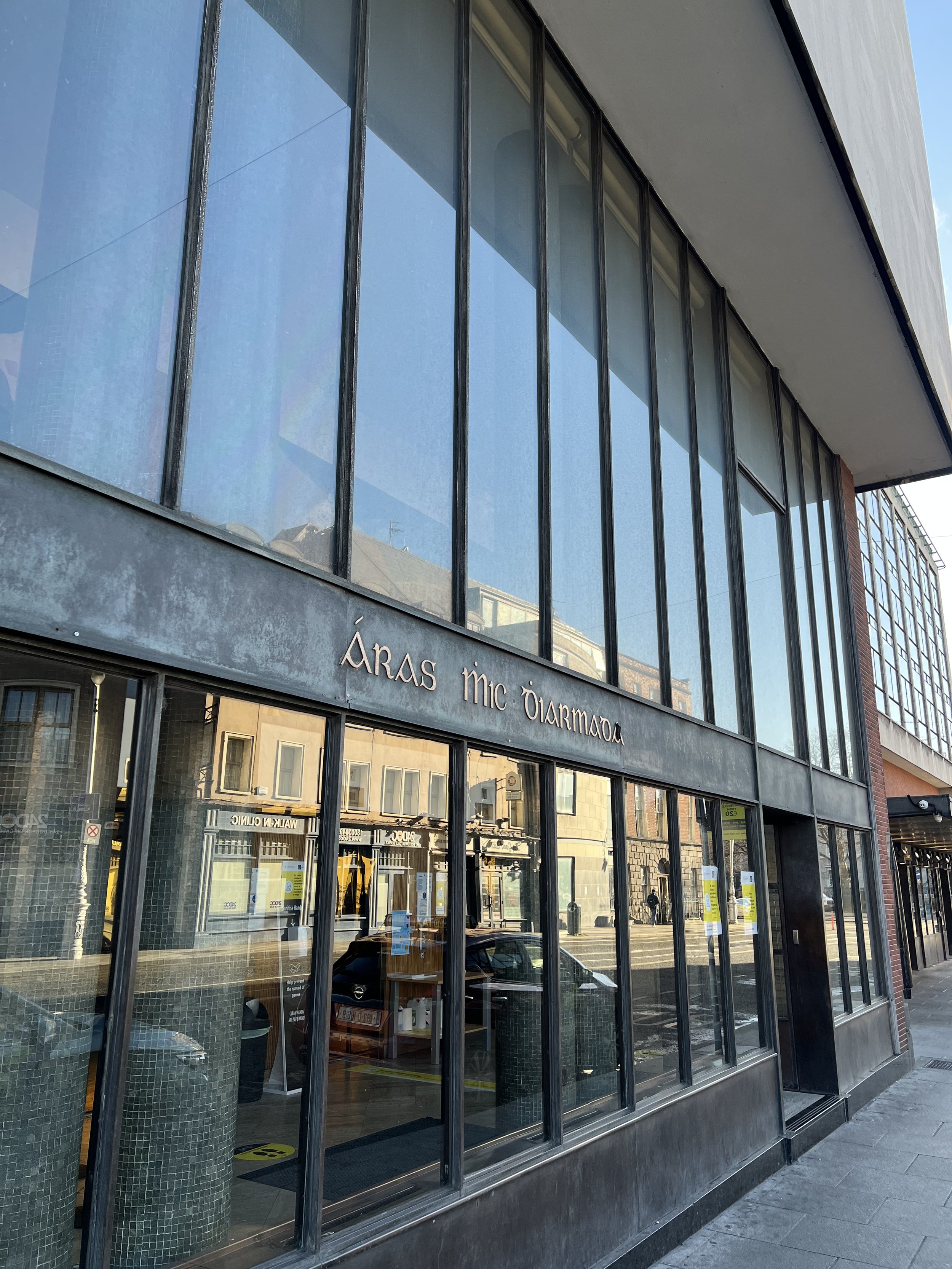
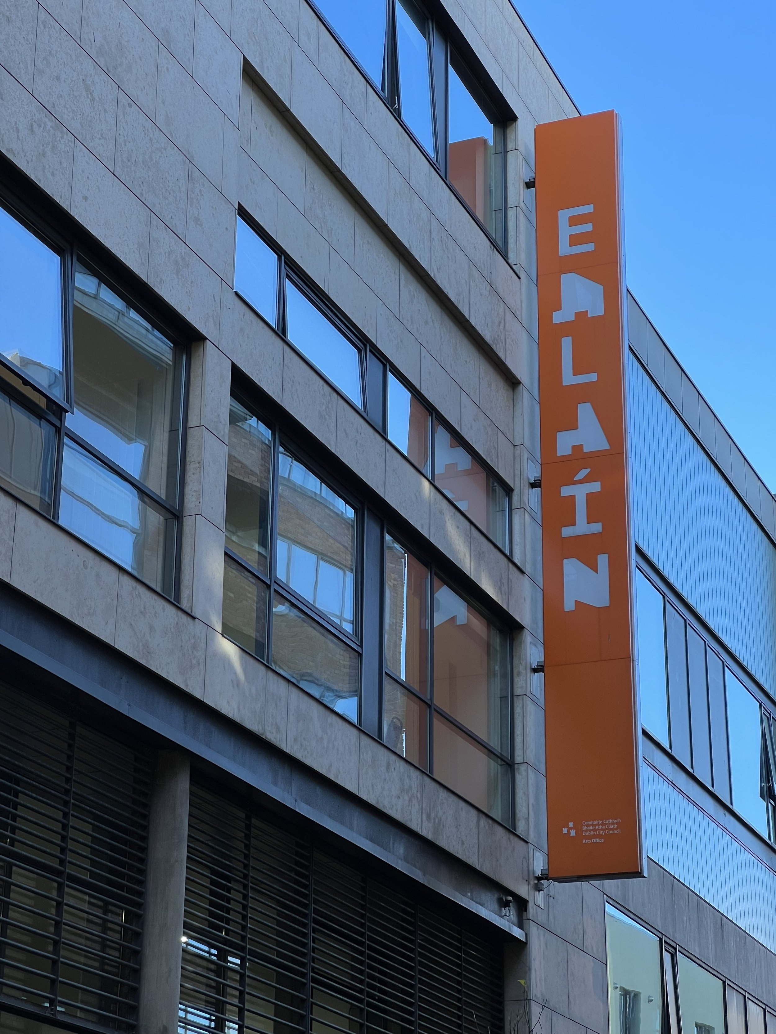
2. Bus Éireann Central Station/ Office of Social Welfare
An example of a traditional Irish Unical done right. The signage sits on the entranceway to the Office of Social Welfare, which is housed in Busáras, a surviving example of a 1950’s Dublin obsession with modernist architecture (designed by Micheal Scott). The building is one of the first examples of the international modern style that was constructed post WW2. The uncial fonts used throughout the commercial areas of the building serve as an example of how traditional Irish typography and language can be incorporated into a more modern housing through the use of material selection that reinforces the traditional curved nature of Unical typefaces.
3. Services Utility Cover
Noticing the ignored. As you look down walking the city, the pathways are littered with service utility covers that provide access fro the utilities required to run the city. While some are ornate in their approach and others standardised, relics of ireland’s flirtation with an international style of typography that was rooted in the Dutch influx of the 1960’s can still be observed. An example of this is the now-defunct Telecom Eireann logo , the ‘Snail’, as the TE logo was nicknamed, which was rolled out in 1983 and lasted 16 years. The company’s trademark was designed by Peter Dabinett of Kilkenny Design Workshops (KDW), which was the world’s first state-sponsored design agency from 1963–1988 and combines the traditional Irish uncial forms of ‘T’ and ‘E’ in modern graphic simplicity.
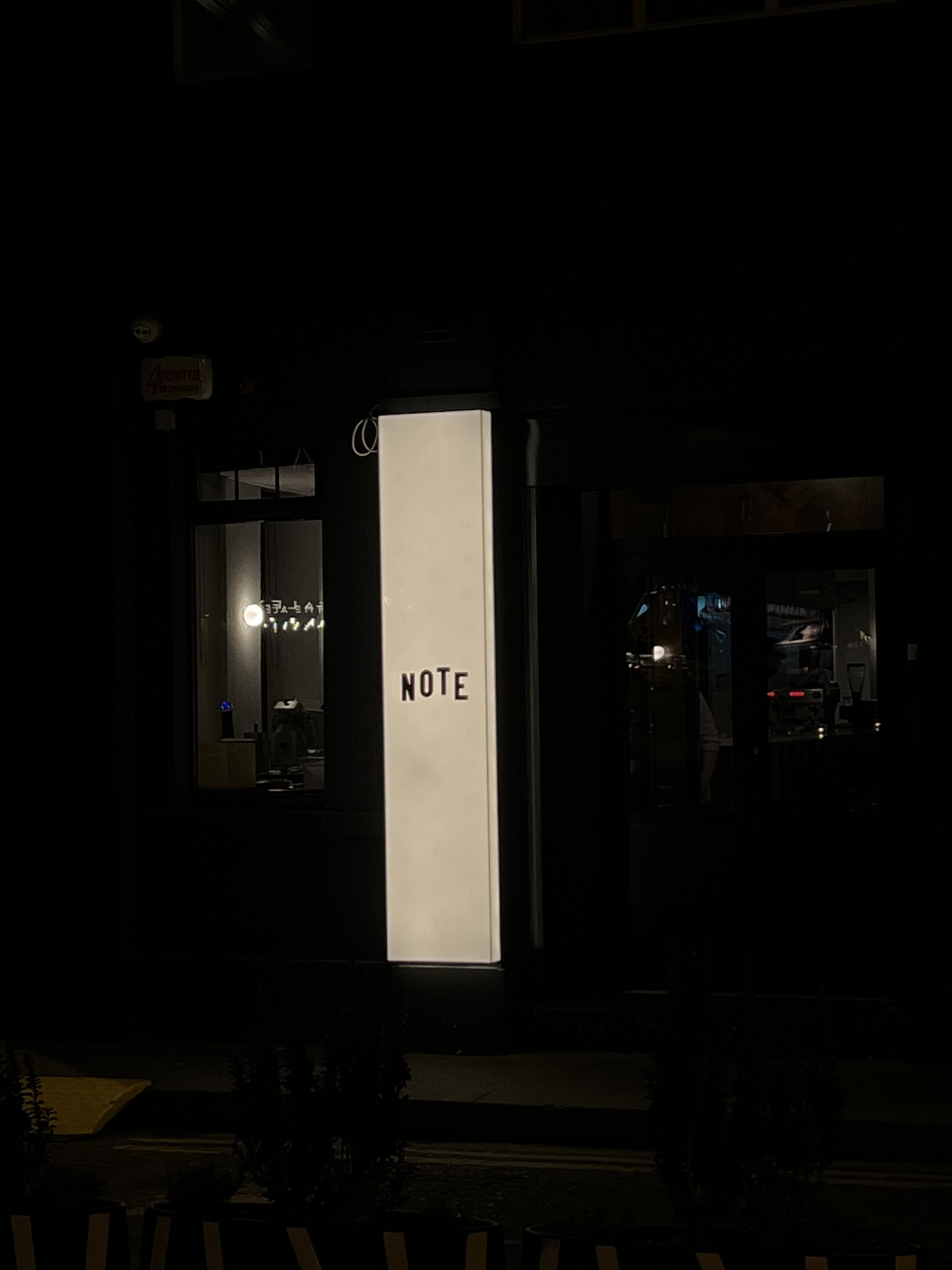
4. Note
An example of the embracing of a more minimalistic approach to lettering and branding, Note is a restaurant opened in in 2021 that plays on a ‘low meets high’ concept that ensures the space and the objects that occupy it are of a very high standard but still have a tactile, analog or “lo-fi” feel to it. This in effect means they balance anything that could be too shiny (expensive) or off-putting to the regular customer with some tactile, familiar or playful. The logo which is a rough unperfect wordmark illustrates this nicely against the backdrop of what will be a new interior with new ‘shiny’ elements. This approach illustrates the embracing of a global vernacular in typography which looks to create a set of visual cues that can be read by those with access no matter what city you are in.
5. Pass Freely – Street Art
A large statement – a mural paying tribute to lives lost to Covid-19 in Ireland during the pandemic. The result of a collaboration between street artist ASbestos and the High Lane Gallery, the artist uses the words of Joseph Beuys to demonstrate effectively how large typographic installations can be successfully incorporated into the city landscape and be used to enforce social messaging through simple lettering. The lettering, though graphic in nature doesn’t suffer from being touched by the hands of a designer and sits comfortably in its environs through the use of its black and white colour scheme which visually recalls St James gate, home of Guinness.
References
The Concise Townscape, Gordon Cullen
https://cuffestreet.blogspot.com/2017/07/signs-for-improvement.html
Marc Augé, Non-Places: An Introduction to the Anthropology of Supermodernity London: Verso
Dixon, B: Word and place in Irish typography.
Typeface Reveals Spatial Economical Patterns – https://www.nature.com/articles/s41598-019-52423-y